An app can look impressive and still be frustrating to use. What changes when you design the journey before the interface.
Why it matters
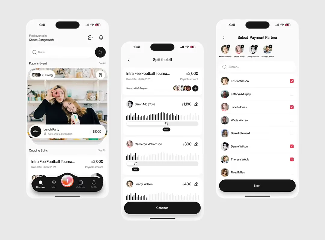
A mobile app can look impressive and still provide a frustrating user experience.
The issue is often not the colours, typography or visual style. It is the journey users have to take to complete a task.
People open an app because they want to achieve something. They may want to book an appointment, make a payment, order a product or manage their account. Good mobile app UX design makes that process feel straightforward.
The strongest app experiences remove unnecessary decisions, make actions clear and help users recover when something goes wrong.
That is why UX should be considered before development begins, rather than treated as a visual layer added to an existing product idea.
How we approach it
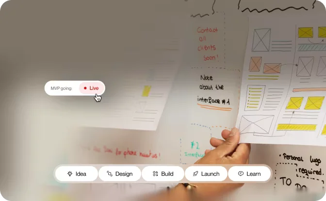
Our approach starts with the problem rather than the interface. We typically work through:
- Understanding the user and business objectives
- Mapping important user journeys
- Creating the information architecture
- Developing wireframes
- Designing the visual interface
- Prototyping key interactions
- Testing the experience
- Working with developers during implementation
- Measuring and improving the product after launch
The goal is not to create as many screens as possible. It is to create an experience that helps users achieve their goals with as little unnecessary friction as possible.
Start with the user problem
A common mistake is asking: “What should the app look like?” A better starting point is: “What does the user need to accomplish?”
Consider a healthcare app. The obvious design task might be creating a dashboard, but the user's real objective could be finding and booking an appointment quickly.
That changes the design priorities. Instead of starting with a collection of attractive screens, the team can focus on the booking journey and the decisions users need to make.
Understanding the problem first creates a much stronger foundation for UX design for apps.
Design the critical journey
Not every part of an app needs the same level of attention at the beginning. Start with the journey that matters most to the user and the business.
For an ecommerce app, that could be completing a purchase. For a banking app, it could be making a transfer. For a subscription product, it might be creating a first project.
Map the journey from beginning to end and ask:
- What does the user know at each stage?
- What decision do they need to make?
- What could cause confusion?
- What happens if something goes wrong?
- What feedback should the app provide?
These questions often reveal problems before expensive development work begins.
Make navigation feel natural
Good navigation should not require users to learn how the application works. Information architecture should reflect how users think about the product.
For one app, that may mean navigation based around accounts, orders and payments. For another, it could centre on projects, tasks and messages.
There is no universal navigation structure. The right approach depends on the product, its users and their goals.
Design for real-world behaviour
People do not always use mobile applications in ideal conditions. They may be distracted, using one hand, dealing with a poor connection or returning to an unfinished task hours later.
Good mobile UX should account for this. That means considering:
- Readable content
- Clear touch targets
- Loading states
- Empty states
- Error messages
- Permission requests
- Offline scenarios
- Accessibility
These details may seem small, but they can have a significant effect on how confident users feel when using an app.
Test before development
A clickable prototype can reveal usability problems before they become development problems.
Instead of asking users whether they like the design, give them a realistic task. For example: “Find an available appointment and book it for next Tuesday.” Then observe what happens.
Where do they hesitate? Which options do they overlook? Do they understand what to do next?
Usability testing is not about proving that a design is right. It is about discovering where it can be improved.
Connect UX design with app development
Design and development work better when they are treated as connected disciplines.
Developers can identify technical limitations, performance considerations and platform-specific requirements early. Designers can then adapt the experience before implementation becomes expensive.
This is one reason working with a team that provides both UI/UX design and app development can be valuable. The result is a product that is not only visually consistent, but also realistic to build, test and maintain.
The next step
If you are planning a mobile application, do not start with hundreds of polished screens. Start with the user problem.
Define the critical journey, prototype the experience and test it before committing significant development resources.
Good mobile app UX design is not about making an application look better. It is about making the product easier to understand, easier to use and more valuable to the people it was built for.